Penguinn

Penguinn

A welcoming online community app that brings neighbors together.

A welcoming online community app that brings neighbors together.

UX/UI Design

UX/UI Design

UX/UI Design

8 Weeks (Mar 2024~May 2024)

8 Weeks (Mar 2024~May 2024)

8 Weeks (Mar 2024~May 2024)

Figma, Figjam

Figma, Figjam

Figma, Figjam

My Contribution

My Contribution

I worked independently as the sole UX/UI designer on this project.

Testimonal

Testimonal

"Penguinn stands out among other community apps that offer similar services. Many apps have security issues or unfriendly user interfaces, making them hard to use long-term. Penguinn truly cares about its users and the community, fostering a positive environment where neighbours can genuinely connect and support one another."

By Grace Park (Interviewee)

Background

Background

Moving to a new city or country can be super exciting, but it's also normal to feel tired, confused, or a bit lonely. One way to feel better is to get involved in your local community. However, nowadays, things are different-our local communities aren't as close as they used to be. With globalisation and all our online connections, it's like we know people all around the globe, yet not the ones right next door.

Moving to a new city or country can be super exciting, but it's also normal to feel tired, confused, or a bit lonely. One way to feel better is to get involved in your local community. However, nowadays, things are different-our local communities aren't as close as they used to be. With globalisation and all our online connections, it's like we know people all around the globe, yet not the ones right next door.

User Interview

User Interview

I conducted in-depth interviews with five individuals who have experienced moving either internationally or domestically.
The goal was to:


  • Understand their feelings and actions after moving.

  • Learn what helped them adjust.

  • Explore how they used community apps (what they liked, didn't like, and how they used them).


👇 Interview Takeaways

Practical needs

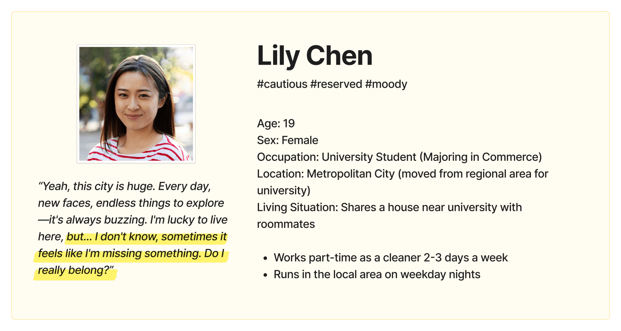
People start using community apps for practical needs like living info or buying/selling. They don't seek entertainment here but often explore other posts, groups, or events once engaged.

Connection with nearby people

Newcomers often feel lonely at first, but they feel more connected through daily interaction with their direct neighbours.


Problem

Problem

There are many community apps on the market, but interviewees mentioned having some pain points with the current ones.


  • It's hard to find desired information due to the poor search function.

  • People are leaving the app because of scams and ads.

  • People want meaningful connections, not just one-time meetups for fun.

Solution

Solution

Streamlined Information

  • Improved Search

  • Organised categories

  • Easy navigation

ID Verification

  • Verify identities

  • Create a space for approved ads

Groups/Forum

  • Create groups for shared interests and goals

  • Create forums

User Persona

User Persona

User Journey Map

User Journey Map

Competitive Analysis

Competitive Analysis

I conducted a competitive analysis of three platforms that offer online community services. Among them, I performed a SWOT analysis specifically for Nextdoor, which is a direct competitor.

I conducted a competitive analysis of three platforms that offer online community services. Among them, I performed a SWOT analysis specifically for Nextdoor, which is a direct competitor.

Balancing Security & User Experience in Verification

Balancing Security & User Experience in Verification

Balancing Security & User Experience in Verification

I talked with users to learn about their ideal number of verifcation steps, aiming to balance between security and user experience.


✅ Base Locations

  • Base locations are places individuals regularly visit and actively engage with. Within the app, users can view and participate in activities only within their registered base locations.

  • The average number of base locations varies based on factors like lifestyle, work demands, and personal choices. Typically, individuals have two main base locations: their home and workplace.


✅ Identity Verification

  • I found out that users usually don't like sharing their ID info because they worry about privacy. They also questioned the need for verifying both mobile and email, pointing out that email accounts can be made without verification. So, I've decided to simplify things and stick to just one step: verifying through mobile numbers only.

Sitemap

Sitemap

Wireframe

Wireframe

Design System

Design System

Design

Design

Sign Up

Sign Up

Group

Group

Market

Market

Accessibility

Accessibility

I focused on making Penguinn easier to use for all kinds of people, so that everyone can have a meaningful experience with us. I followed the WCAG 2 Guideline to ensure my design is accessible.


  • The contrast ratio between the background and foreground colors is 15.12:1, which is higher than the WCAG minimum standard of 4.5:1.

  • The contrast ratio of the primary button color is 5.18:1.

  • The smallest font size is 12pt, and users can adjust the font size in the settings.

Takeaways

Takeaways

For this project, I really focused on understanding users since the app is all about bringing people together. I especially enjoyed talking to people from different cultures during interviews and research. Here are some key takeaways from the project:

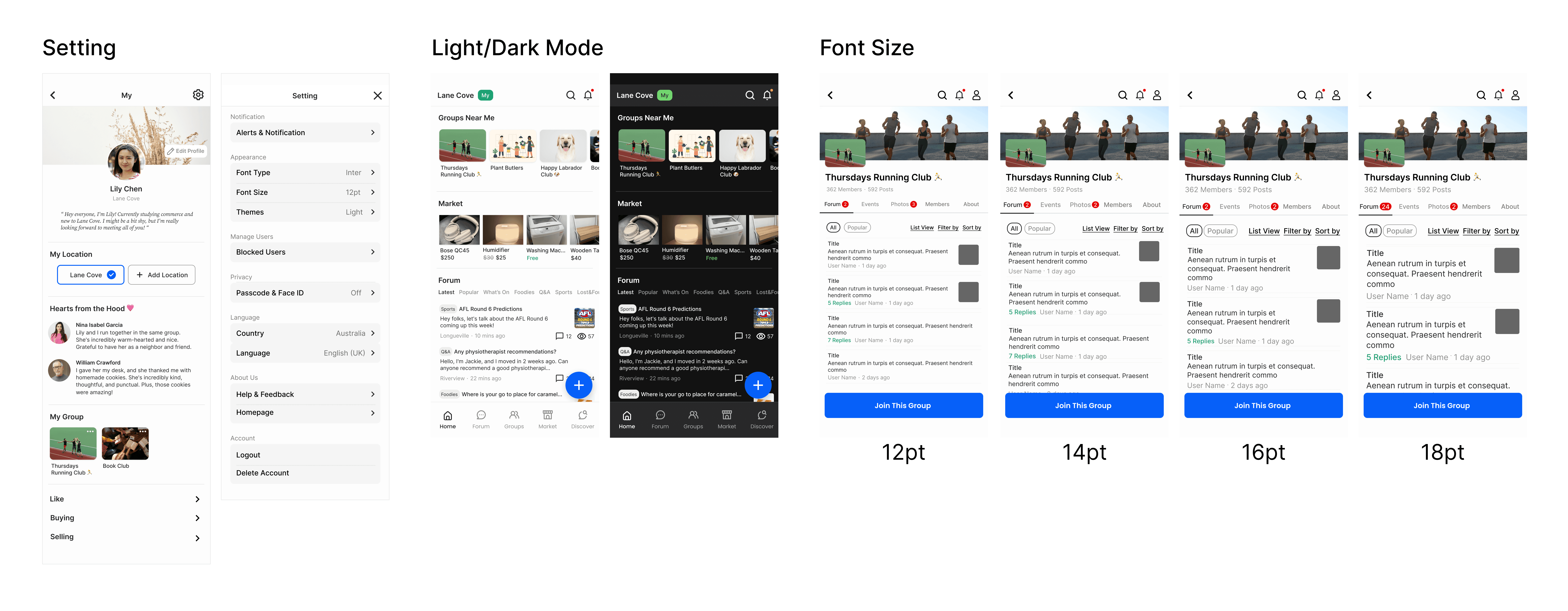
Consider accessibility and offer customisable options to make better user experience for people from diverse backgrounds.

Create a solid information structure for the app to remain helpful for the community in the long term. Since people's interests may change, I will ensure the app can adapt easily to meet their evolving needs.

Building reusable UI components ensures consistency throughout the app and save a significant amount of time.

@Hayoon Jung 2024