Background
Public library as a pillar of community life:
Bridging the gap between online and offline experiences ✨
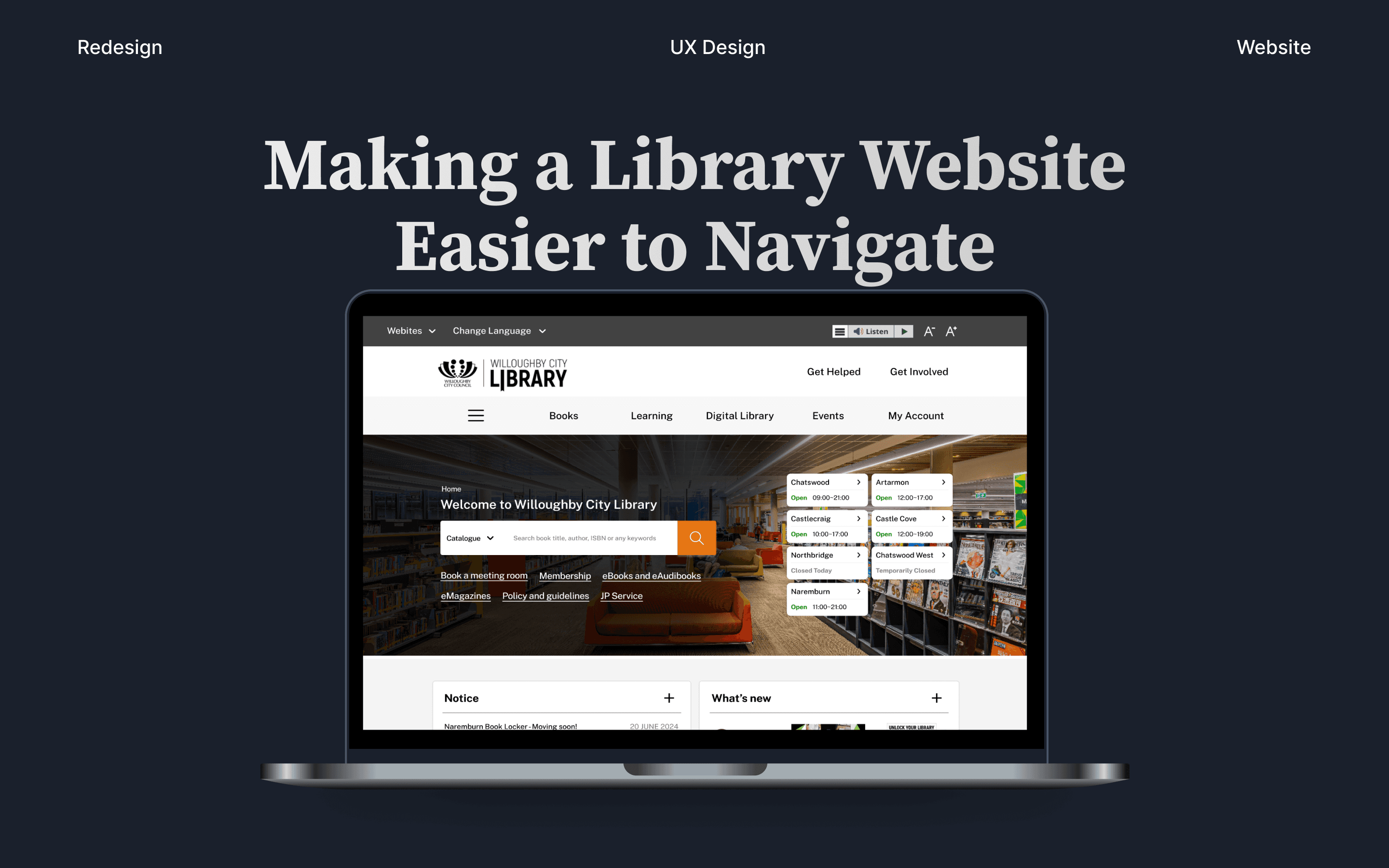
Public libraries are more than just places for books. They're community hubs that offer reliable information and learning opportunities for everyone. However, while chatting with a friend, I realised that the library's website didn't reflect the same welcoming experience as the physical space. The site felt confusing, difficult to navigate, and a bit cumbersome, which led me to redesign it.
Figma, Figjam, Google Form, Google Trends
UX Research, UX Design, Information Architecture
Challenge
Confusing Navigation and Unclear Content Structure
The Willoughby City Library website offers helpful features, but the current menu layout and user flow are confusing. Users often struggle to find key information, as content is scattered and not grouped in a way that supports intuitive browsing.
Objective
Improve Navigation and Clarify Information Architecture
The goal of this redesign is to simplify the user journey and reorganize content to make browsing more intuitive. By refining the site’s structure and user flow, the library can better support community members in finding events, services, and resources with ease.

Research
Understanding how people use the library and its website
🎯 Summary: What users need from the library website
🔍 See the full result
Information Architecture
Breakdown of the current website structure
To understand the structure of the current website, I measured the dimensions of each section to see what is highlighted. Then, I created a sitemap to show the current layout of information.

Information Architecture
Sitemap revision for improved user navigation
Some pages were listed under two different categories, so I reorganized them into a single category.
I regrouped pages under major categories such as 'Books,' 'Learning,' and 'Facilities and Services' based on user needs identified during my research.
I created 'Get Involved' and 'Get Help' categories to enhance user engagement.

User Flow
Key user flow challenges
From my research, I identified two important user flows related to the needs users have from the library's website:
Checking Opening Hours & Facilities: Users find it difficult to quickly access information about the library’s hours and available facilities due to the site’s current layout, requiring multiple steps to find this essential information.
Reserving a Meeting Room: The current process redirects users to an external site for meeting room reservations, interrupting the user experience. Streamlining this process within the main site could significantly improve convenience and satisfaction.


Design
Lo-fi Design
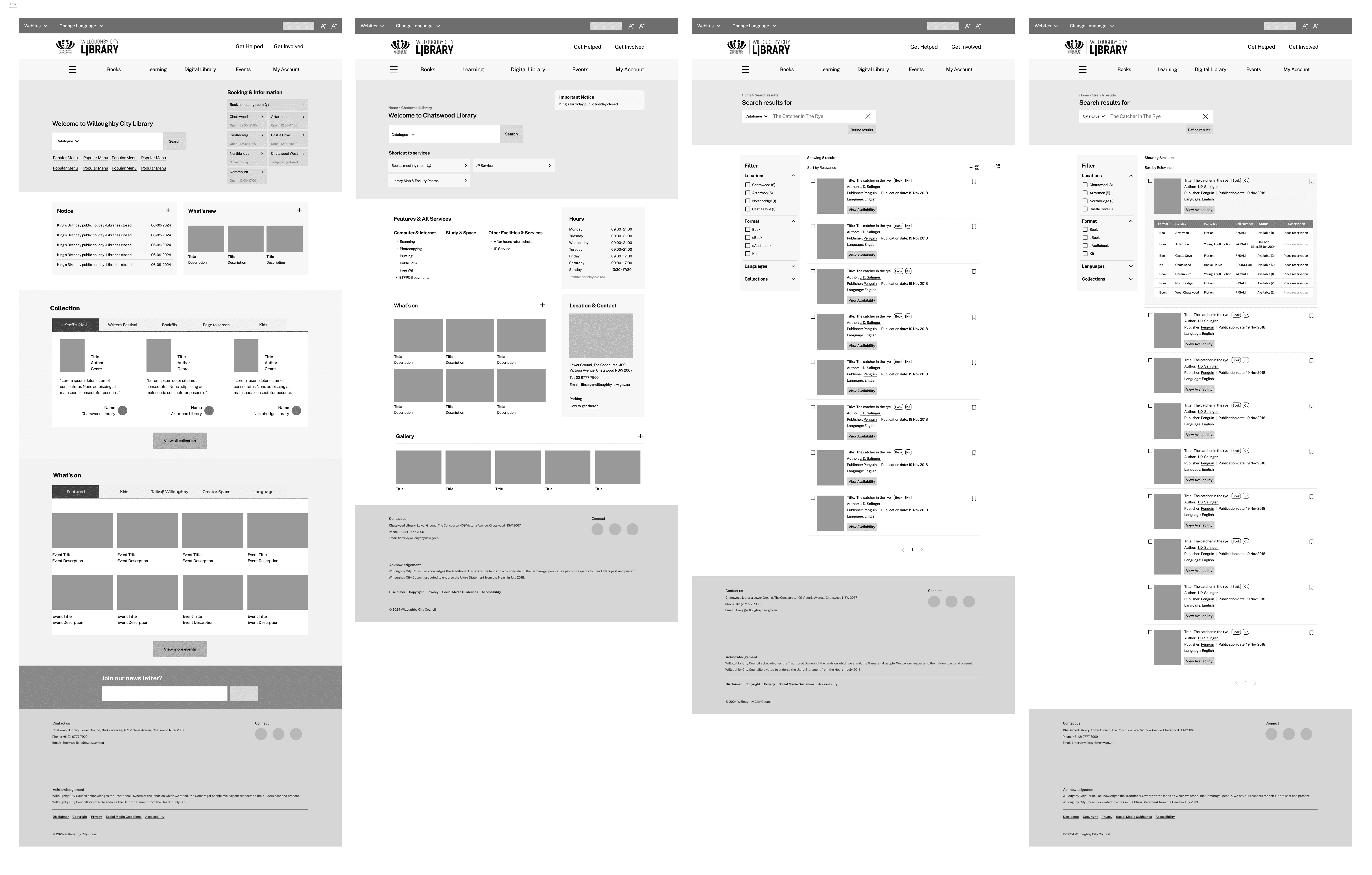
Design
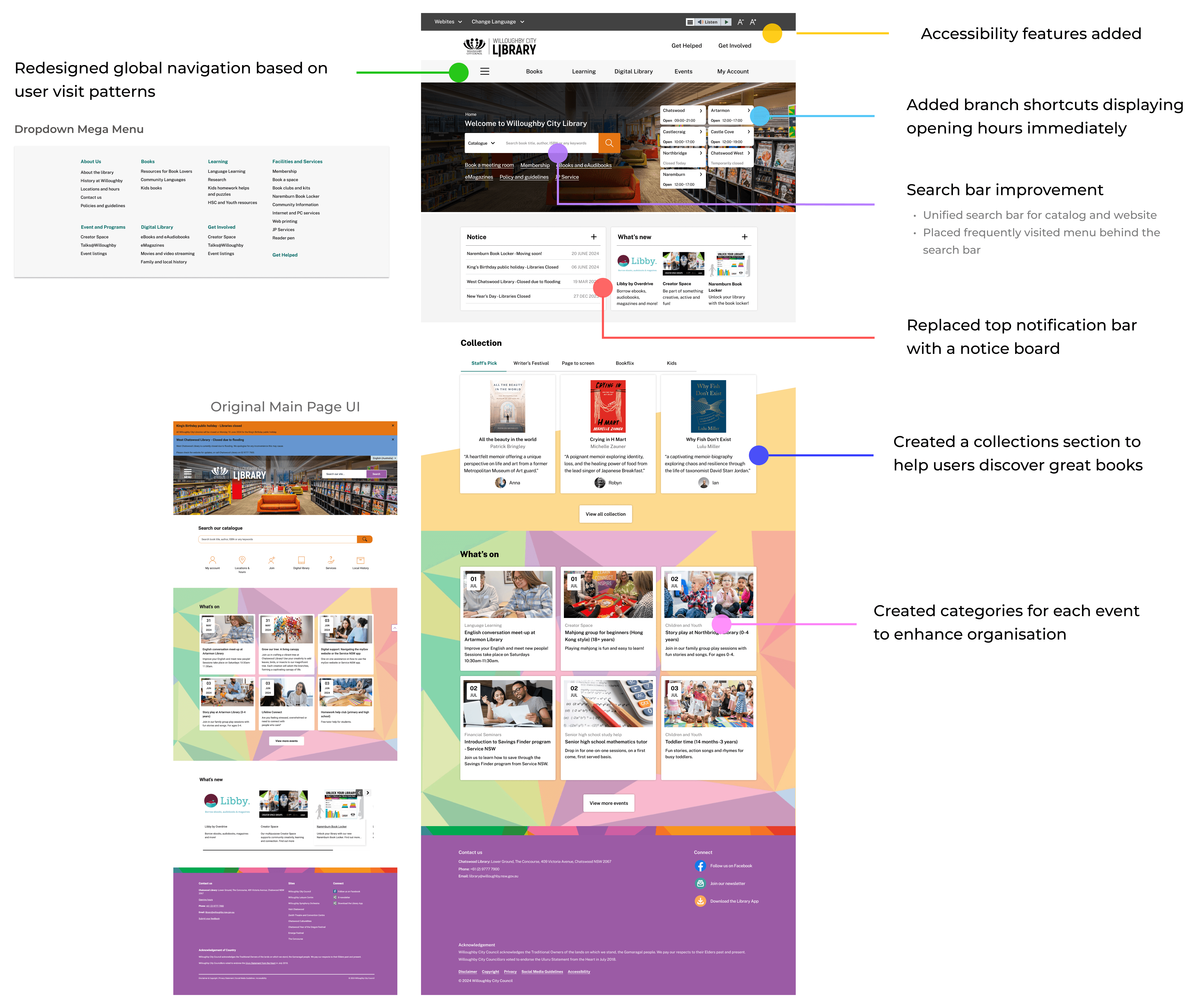
Hi-fi Design
💡 Main Page
💡 Branch Page

Result
Measuring the effectiveness of new user flows
I conducted a user test to determine if the proposed user flow meets the needs of users. Two participants, who had never used the library website before, were given two tasks corresponding to flow 1 and flow 2. I timed how long it took each participant to complete each task.
The results showed that my design significantly reduced the number of steps and the time required for users to obtain their desired information on the website.
Average Improvement
Average Improvement
Iteration
Challenges improved during the design iteration
Branch information and shortcuts are integrated into the global navigation for streamlined access, preventing overflow on the main menu.


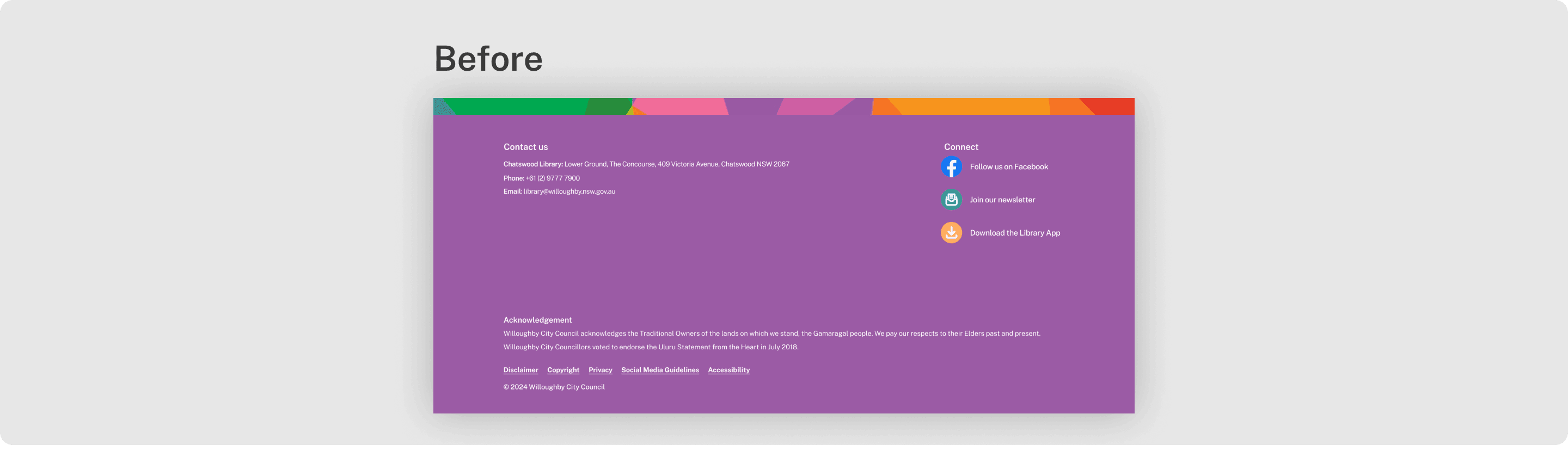
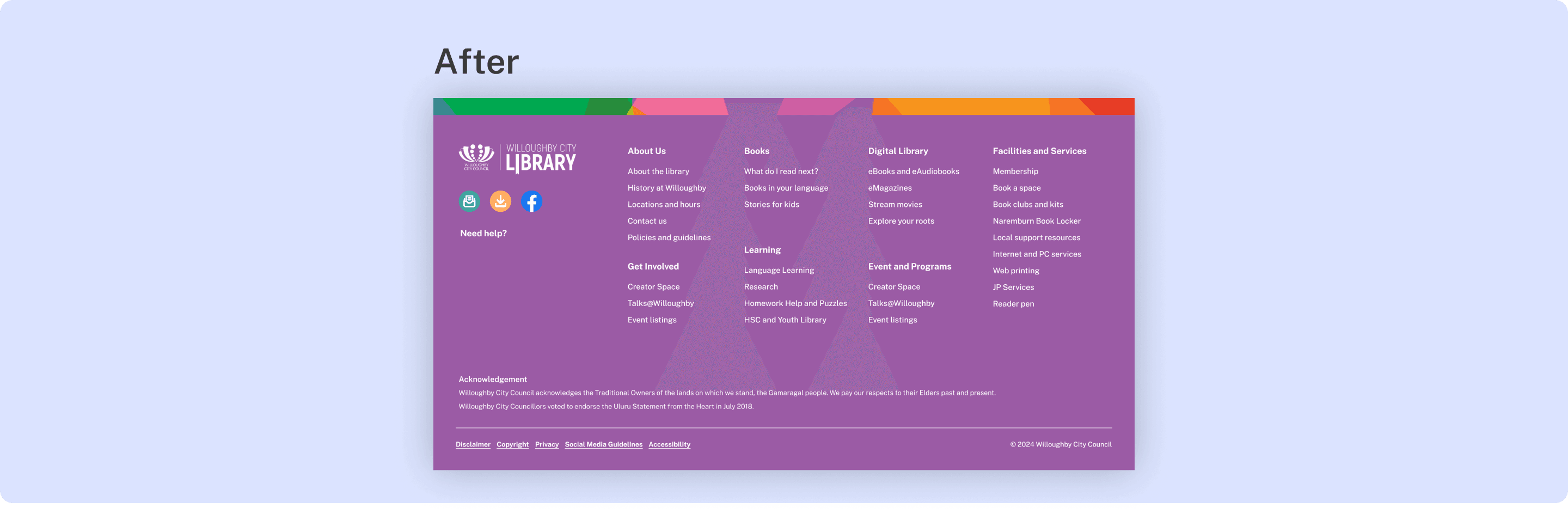
Redesigned to a fat footer for easier navigation without scrolling back up.
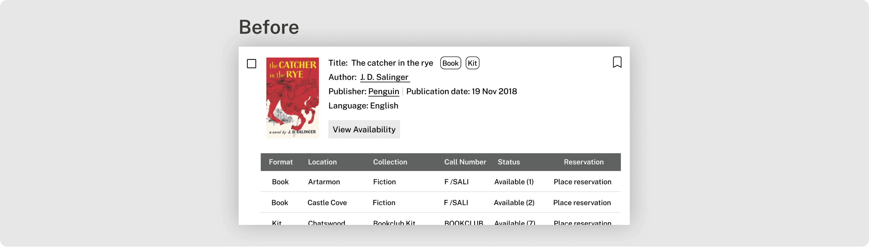
Users can intuitively view availability for each branch and online without needing to click 'view availability,' saving time and effort.

Design
Final Design

Key Takeaways
Learnings
Content Management
I learned the importance of creating a flexible layout that allows for easy updates. This ensures the library website can stay current with news and materials without disrupting the overall design.
Improved Information Architecture
I realised that a clear and intuitive structure is crucial for user satisfaction. By reorganizing the site, I saw firsthand how simplifying navigation can significantly improve the user experience.
User-Centered Design
Through extensive research, I understood the value of deeply knowing your users. This insight was key in designing a website that truly meets the diverse needs of the library’s audience.